Personal Background:
He Had immigrant parents. Was born in Plainfield, New Jersey and attended Philadelphia Museum school of Industrial Arts in 1934. In 1941 he went to Mexico to paint. He wasn’t happy with the paintings and destroyed them. Once he returned to New York he was hired by the Vogue art director Alexander Liberman. He was sent out to photograph ideas for Liberman who encouraged him to photograph things he envisioned.
Style:
He takes primarily still lifes and portraits. His portraits are in black and white. Some of his still lifes are colorful while others are black and white. His photography fits into the ‘modern photography” genre. Some of his photographs are very creepy while others convey a very happy mood. Such as skull still lifes and colorful flower still lifes.
Philosophy:
He was inspired by surrealism. An artistic movement that began in the 1920s. He wanted to convey the person's personality when he was photographing someone. He also wanted to show a side of someone that no one new about. He did this when he was taking a picture of a celebrity. He brought fashion photography into the picture during his career.
Influences:
He has made me more connected to what I was photographing. If I have no connection to it in some way, why am I capturing the moment. Art without emotion is like chocolate without sugar. When I take a picture I now think about the emotion I’m trying to convey. He has a quote that sums it up perfectly "A good photograph is one that communicates a fact, touches the heart, and leaves the viewer a changed person for having seen it; it is in one word, effective."
Compare and Contrast:
I think this is my best photo in my final report. I had all the resources I needed to create a good replica. I am not sure what he used on the plate but I used ripped up basel. I wish I could have incorporated more shadows in mine but I couldn’t get my lighting right after multiple attempts. Despite not having the shadows I wanted I still think it is a pretty good replica photograph
This might be my least replica photograph. I took a gamble when choosing which flower I would use. I got the most similar flower as I could. I left the rest for photoshop work. I tried to match the colors more in photoshop but obviously it is hard to make a replica without the same resources. I think in the end it turned out okay though. Not quite what I wanted but I can see similarities.
I think this replica was pretty good. Once again I didn’t have the same resources but I can see clear similarities between the two. While Penn had a white pot with black spots, I had the opposite. I didn’t want to make it so dramatically changed where it doesn’t look real but I also had to change it to make it look more like the white pot. I think in the end it ended up as a pretty good replica.
Personal Artist Statement:
All my images have some kind of deeper meaning. I chose images to replicate that in some way relate to me. Especially the tea pot. I like the texture of the tea pot I used to replicate. Tea is something I associate with being relaxed and I think you can feel that when you look at the photograph. I think the size of the flower could have been better because it didn’t take up a lot of space. These replicas in total I think are good and convey the same emotions as the originals.
Sources (Images and Report):
https://irvingpenn.org
https://www.theartstory.org/artist-penn-irving.htm
http://www.washingtonpost.com/wp-dyn/content/article/2009/10/07/AR2009100703848.html?noredirect=on
https://petapixel.com/2018/06/22/10-things-i-learned-from-irving-penn/
https://kinfolk.com/irving-penn-centennial/
http://vukelichphoto.com/blog/2017/5/23/irving-penn-at-the-met

Untitled (Table With a Dirty Plate)
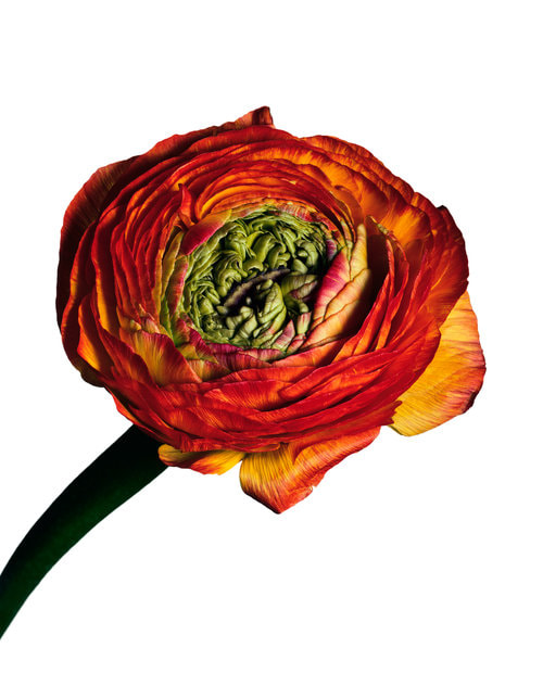
Untitled (Vibrant Red Flower)
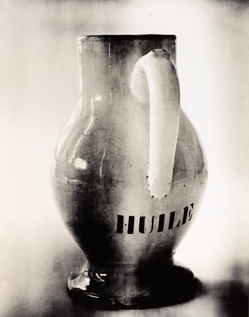
Untitled (Burnt Cream)
|

Basel and Cloth

Sad and Lonely Flower

Old Black Tea Pot
|
